Boston Magazine Tribute Cover
I think this is a fantastic and apt cover on the May edition of the Boston Magazine...
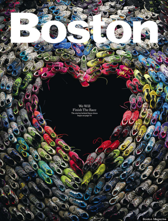
We initially settled on the idea of commissioning Marathon-related essays from a number of Boston writers, and then set about brainstorming ideas for illustrating that package of stories. Should we create a photo illustration of a runner’s bib in the shape of a heart? Should we photograph a tattered marathon olive wreath on a black background? Then our design director, Brian Struble, and deputy design director, Liz Noftle, came up with the concept of taking shoes worn during the marathon and arranging them so that the negative space is in the shape of a heart. For reasons I’ll explain in a moment, I knew as soon as I heard the idea that we had our concept—not just for the collection of essays, but also for the cover. In fact, I quickly realized that the stories of the runners who wore those shoes would be even more powerful than the essays we’d commissioned. We quickly changed course and settled on the cover concept and the outlines of a feature package: We’d shoot the shoes collectively to form the heart, but we’d also photograph them as individual pairs to illustrate the stories told by the runners in the package (which we called “The Shoes We Wore,” and which you’ll find in the May issue).
— Behind Our May Boston Marathon Cover
What a great idea and fitting tribute. I really like the picture and would love to get a copy of the base image without the text.
Of course I instantly noticed the pink Vibrams at the top of the heart 🙂